meridian
BRAND BOOKV0.1 · SEP 2026RESEARCH WITH HIGHER STANDARDS
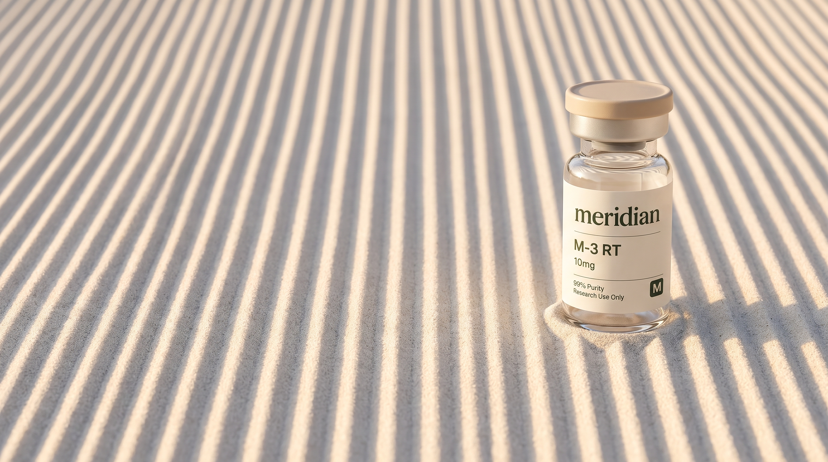
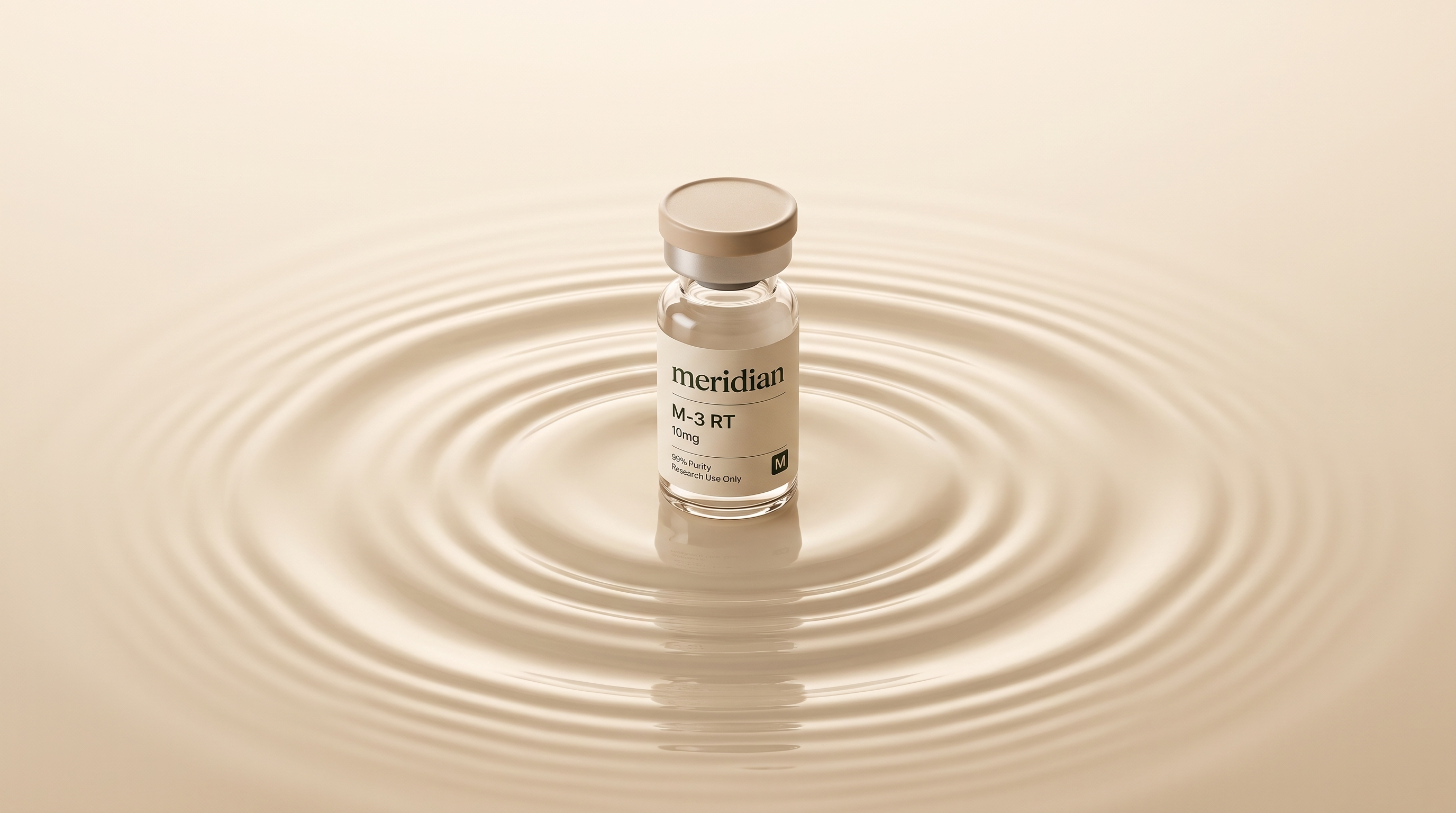
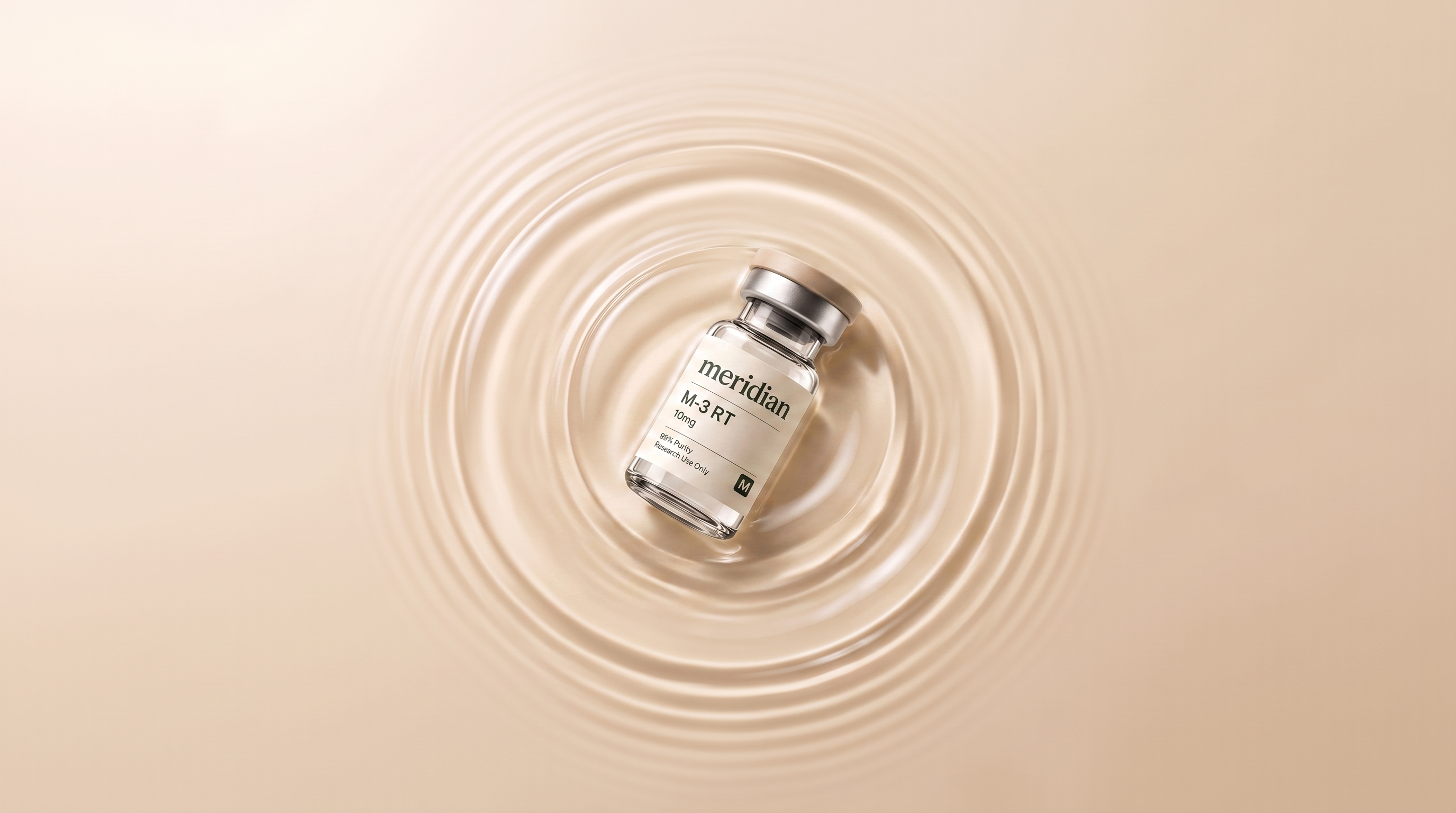
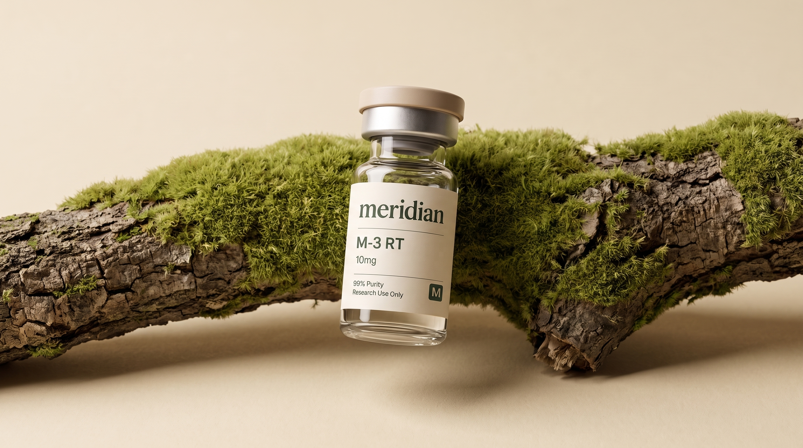
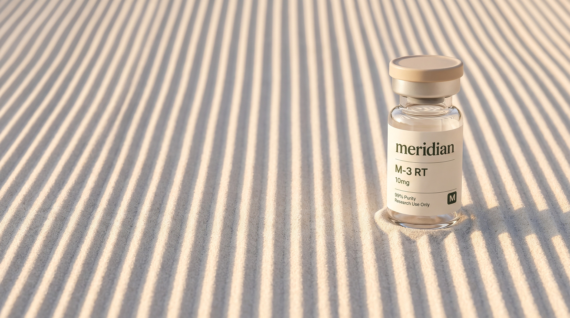
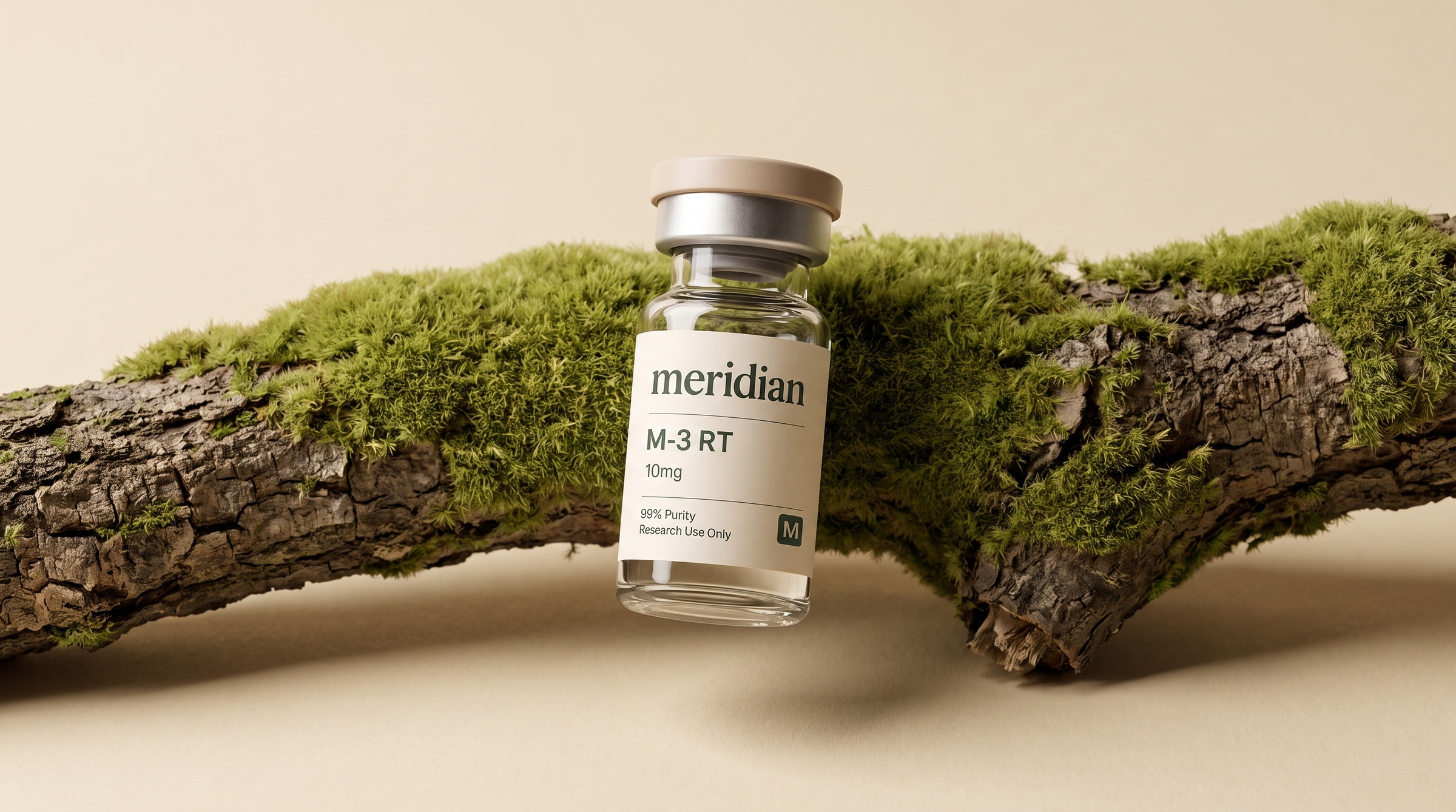
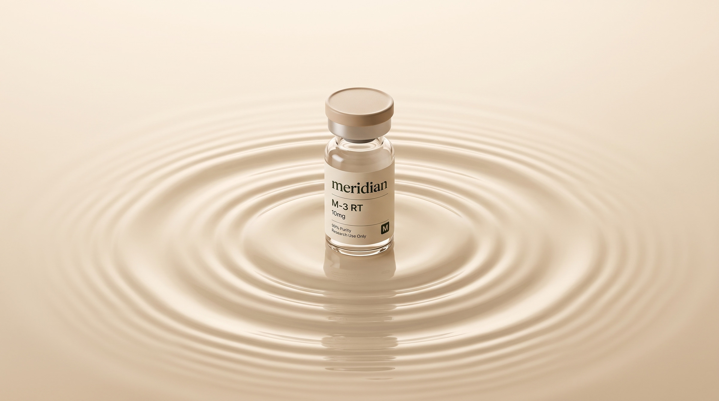
We love nature, and we can control it. That sentence is the whole identity. Everything meridian shows the world is a natural surface — raked sand, still water, moss on bark, a dried leaf — photographed warm and calm, japandi, one product in it.
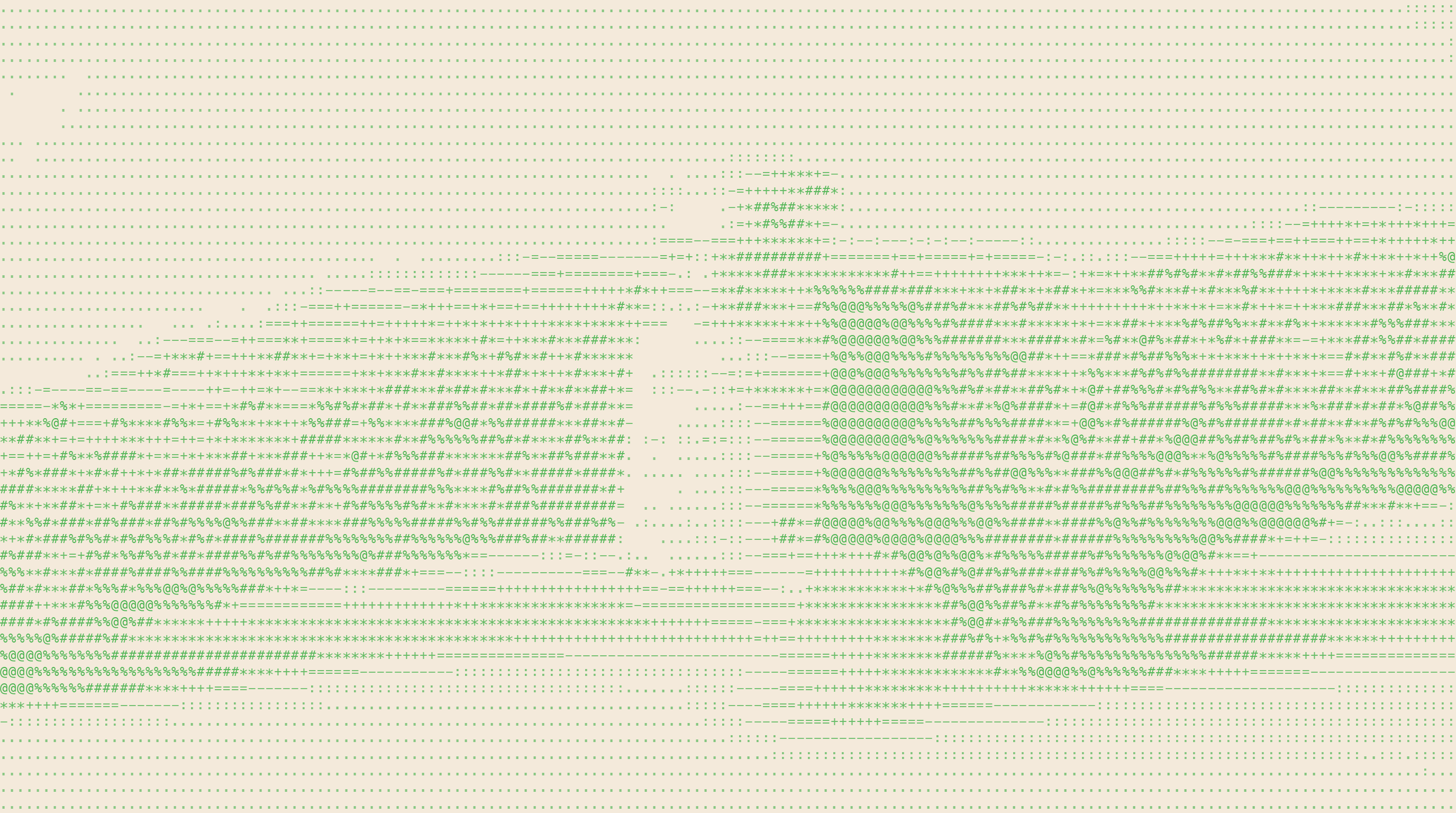
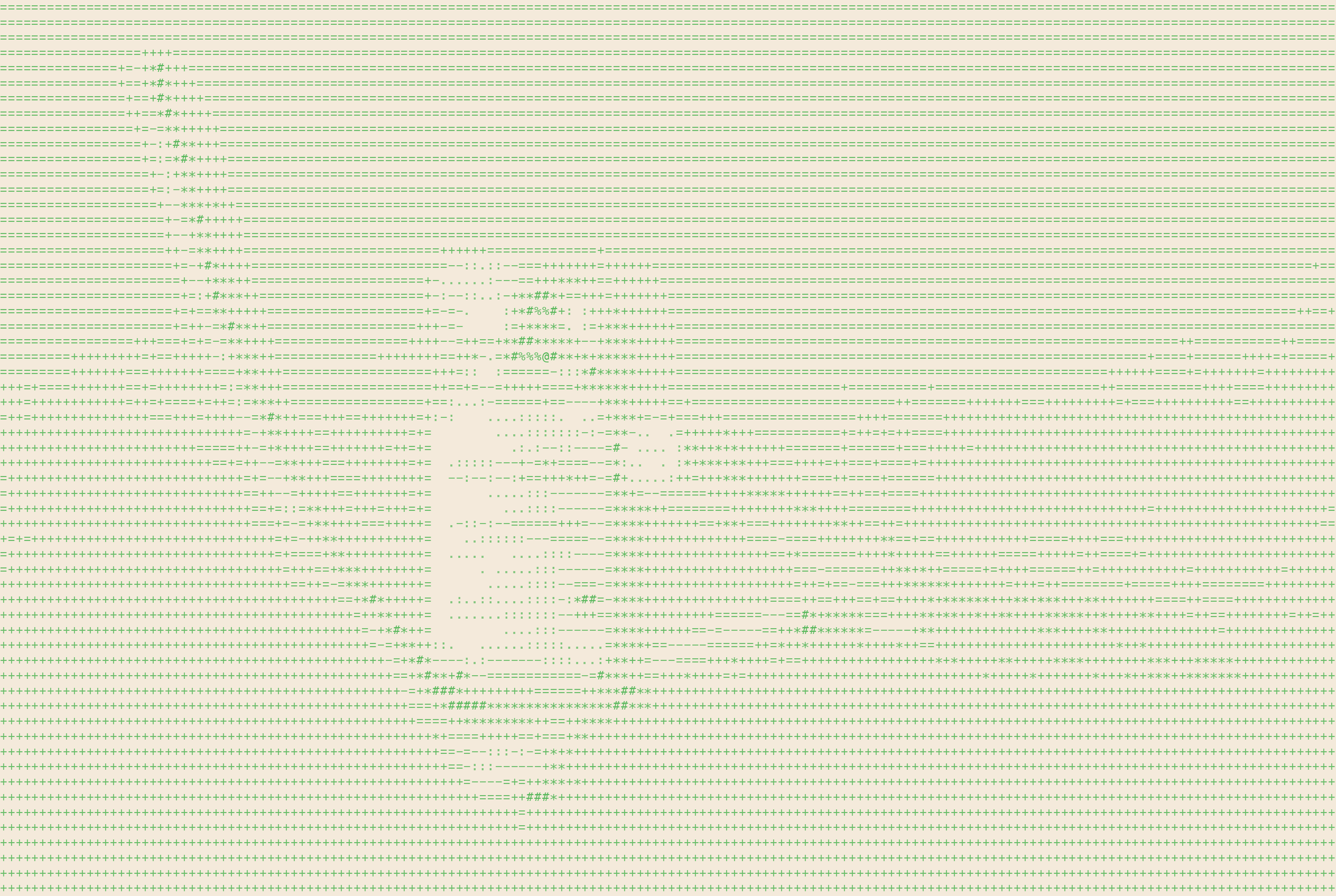
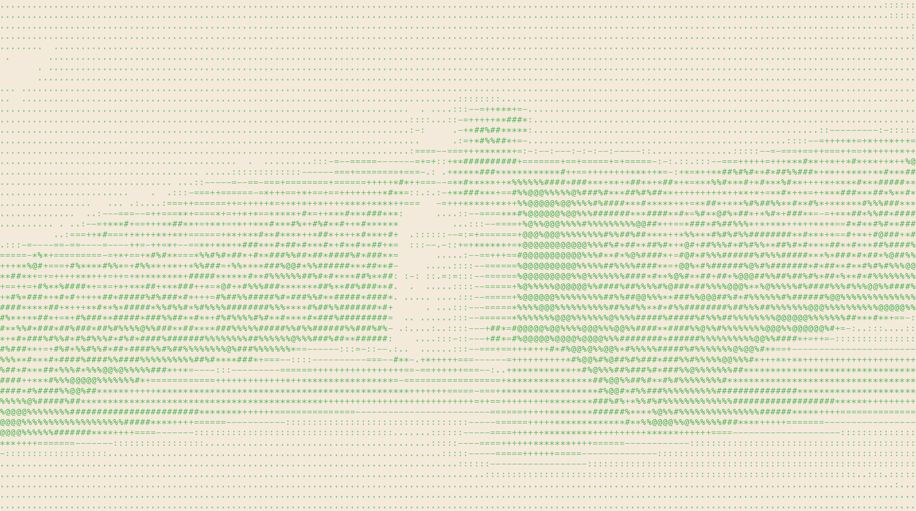
Under the hood is the lab. Beneath every surface sits the same image rendered as data: characters, dots, a grid. It appears on hover, on scroll, inside the pack, in the loading state. It is never the first thing you see and it is always there.
Surface is what we sell. Under the hood is why you can trust it.
$ render --surface moss --layer ascii
 THE SURFACE
 UNDER THE HOOD
meridian, lowercase, always. One serif face, one weight, set tight, in forest green. Nothing sits beside it and nothing sits behind it.
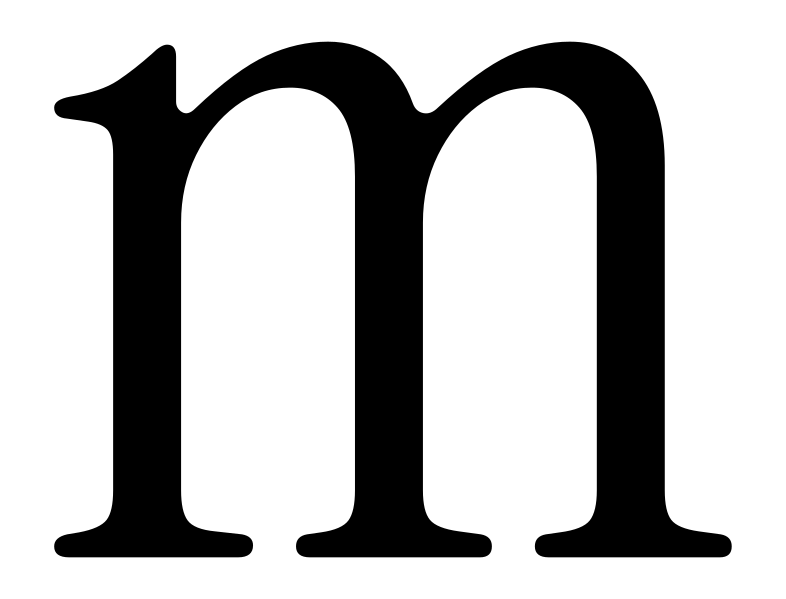
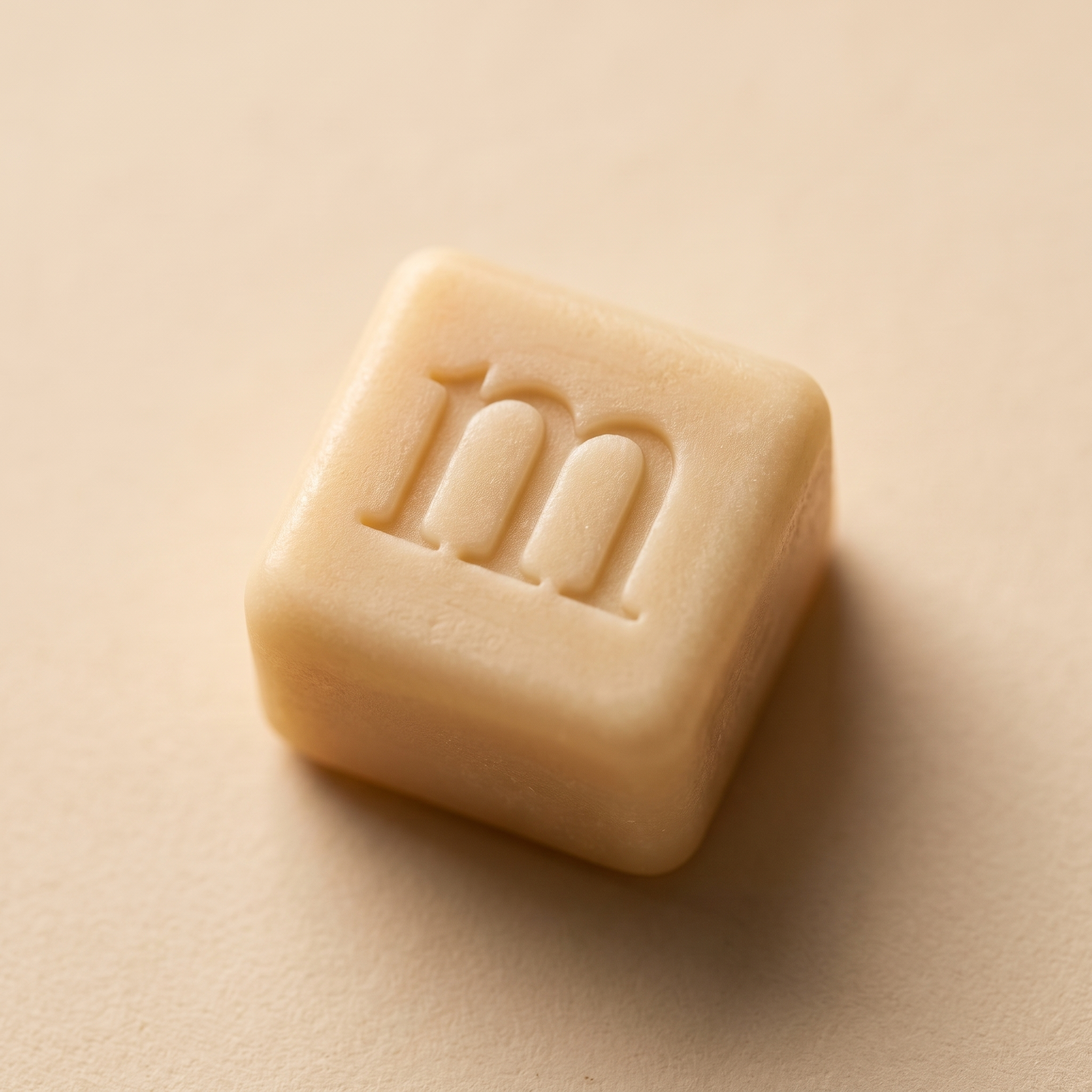
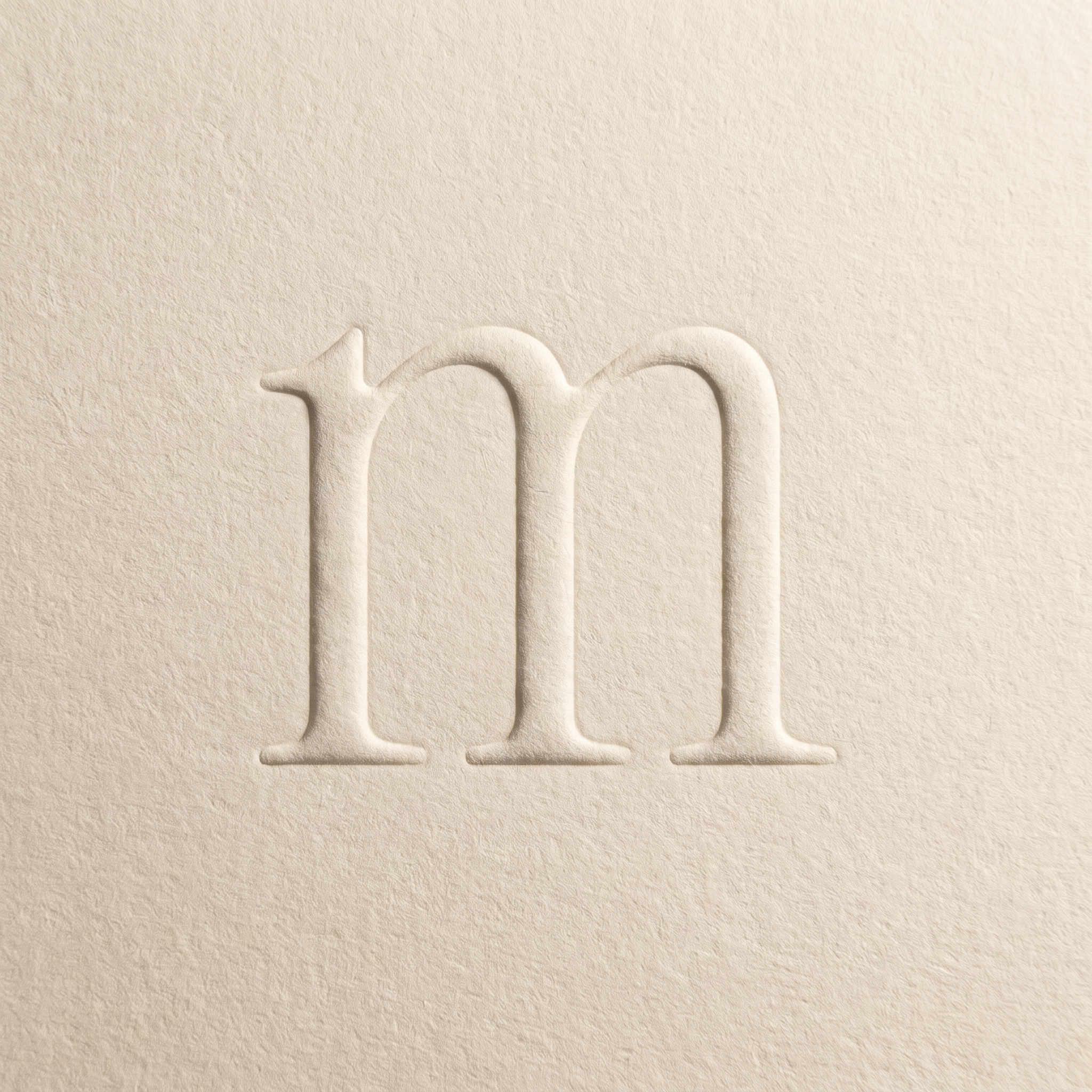
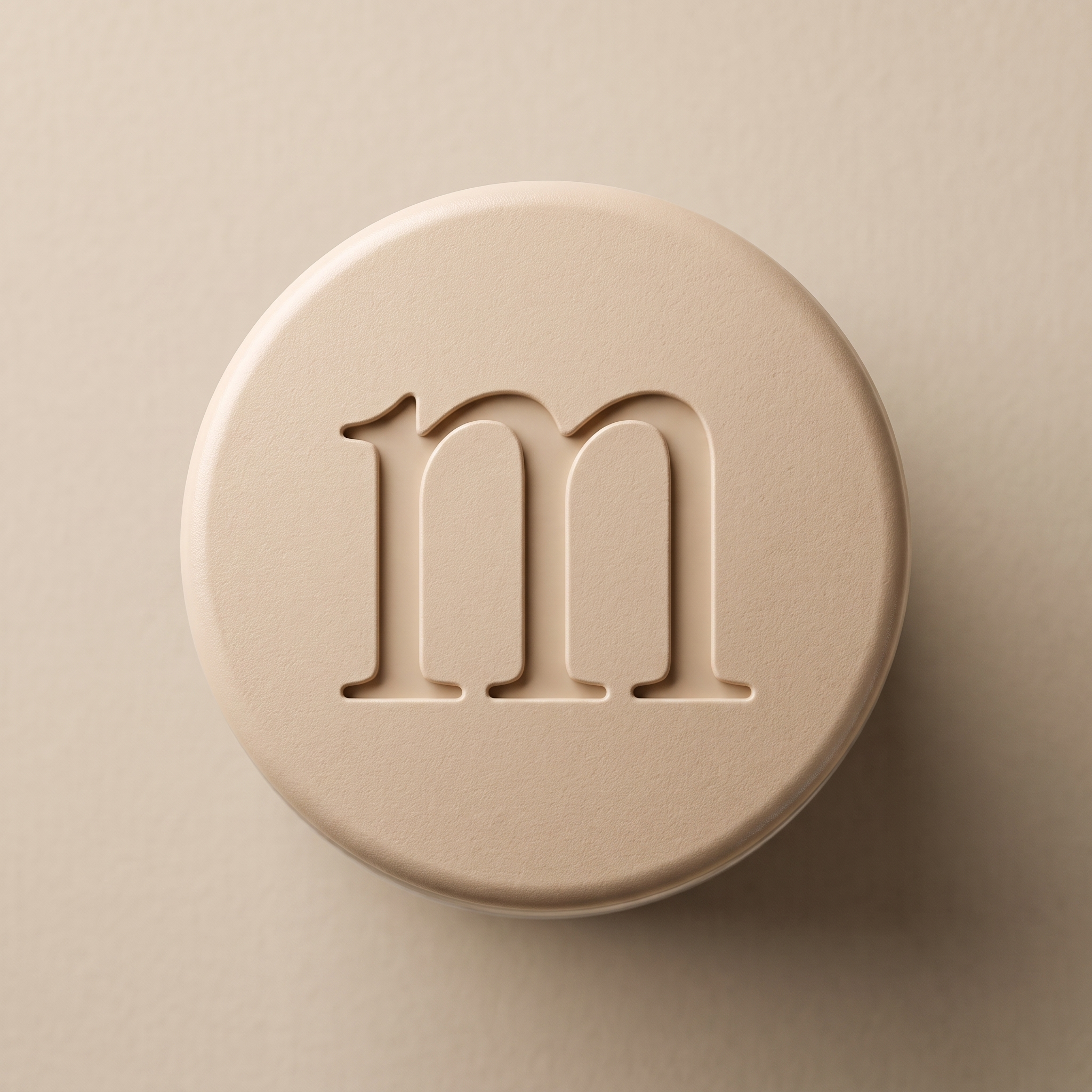
The wordmark is the identity. Where there is room for the word, the word is used. The lowercase m on its own is second: the wordmark’s own letter, cut from the same serif, and always pressed rather than printed — into the cube, into paper, into the cap. It is never set in ink on its own and never put in a box.
The M badge is third, and functional. A capital M in a small forest rounded square, it does the jobs a serif cannot: the corner of the label, the app icon, the favicon. It never stands in for the wordmark and never appears at a size where the wordmark would fit.
Under the hood, the badge has a character twin for loading states and the lab view. Same rank: third.
Clear space on every side is the width of the m. Ink on vanilla and paper; vanilla on ink and bark. Never on the Ecophilia green — on that ground the product carries the name.
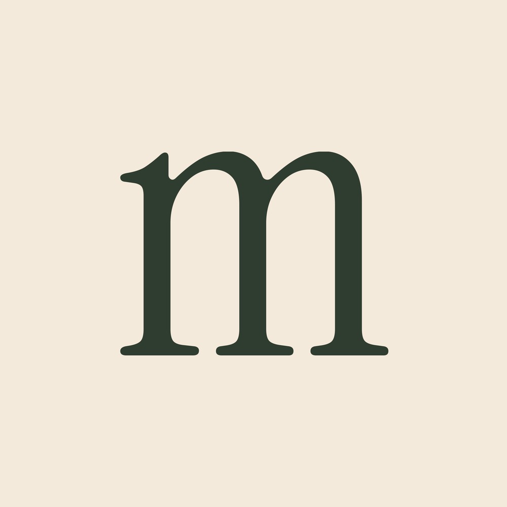 SECOND · THE LOWERCASE M · THE LETTERFORM
 THIRD · THE BADGE · LABEL CORNER, ICONS
 THIRD · THE BADGE UNDER THE HOOD
 THIRD · ON FOREST · LOADING STATE
Six natural tones and one loud one. Vanilla is the ground for almost everything. Sand and caramel are what vanilla does in warm light. Moss and bark are what sits on it. Forest is the ink: there is no black anywhere, the type on the label and on the page is this green.
Ecophilia green is the exception. It is the colour of the product book and of the layer under the hood, and it belongs nowhere else. It never becomes a background for the wordmark and never tints a photograph.
Every value here was read off the photography, not picked from a wheel.
| HEX | #F4EADB |
| USE | Ground |
| HEX | #CDB89F |
| USE | Surface |
| HEX | #A8763E |
| USE | Accent · links |
| HEX | #6E7436 |
| USE | Secondary |
| HEX | #5C4634 |
| USE | Dark ground |
| HEX | #2F3D30 |
| USE | Ink · type |
| HEX | #44B24B |
| USE | Book · hood |
 VANILLA · SANDMOSS · BARK
 ECOPHILIA · THE BOOK ONLY
Instrument Serif is the voice. It is the wordmark and every headline, always lowercase at display sizes, set tight, never bold and never italic for emphasis.
Inter does the reading: body, labels, the compound name on the pack, dosage, navigation. Regular and medium only.
JetBrains Mono is under the hood. Batch numbers, lab data, the ASCII layer, captions in this book. It is set in signal green when it sits on vanilla and in vanilla when it sits on ink. It never carries a headline.
| ROLE | FACE | SIZE | CASE | SAMPLE |
|---|---|---|---|---|
| Display | Instrument Serif | 96–210 | lowercase | meridian |
| Headline | Instrument Serif | 40–72 | sentence | Research with higher standards. |
| Body | Inter 400 | 15–18 | sentence | Every vial ships with its batch documentation. |
| Label | Inter 500 | 11–13 | as named | Compounded Semaglutide · 5 mg/2 mL |
| Data | JetBrains Mono | 10–12 | lowercase | purity 99.4 % · lot 0926-014 |
A real surface, warm low light, one product. The ground is always a natural material that has been touched by a hand: sand that has been raked, water that has been disturbed once, a branch that has been cut. That is the whole brand in one picture — nature, and the evidence that we shaped it.
Light is late afternoon, from the side, so the surface has grain and the product has a shadow. Palette stays in the six natural tones. Nothing candid, no people, no interiors.
The product is never treated: the label reads, the cap is vanilla, nothing crosses the glass.
CLICK ANY PLATE TO DOWNLOAD
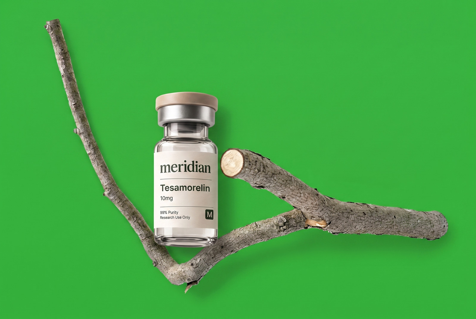
The product book. Constantin Boym’s Ecophilia puts one found branch on one flat green page and lets it be the whole page. We take the format and subvert the subject: every page is a new offering, sitting on or hanging off a different piece of nature.
One product per page. One natural object per page, and never the same kind twice: lichen, bark, a cut branch, a leaf, a stone. The green is flat and exact. The type, when it comes, is Helvetica-plain and small, top right, the way the book does it.
This is the only place the Ecophilia green lives, and the only place the product is shown on a coloured ground.
CLICK ANY PAGE TO DOWNLOAD
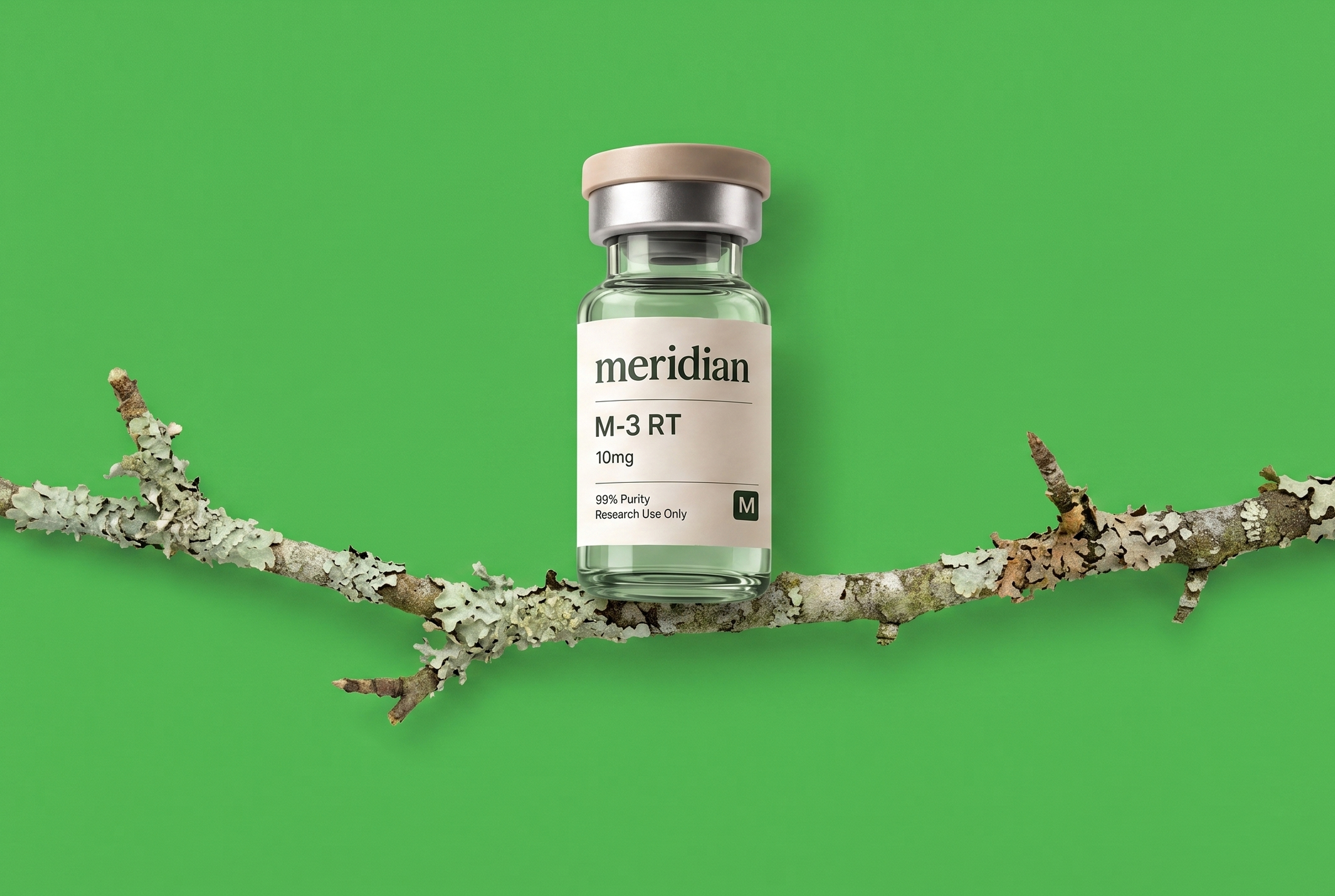 M-3 RT · LICHEN
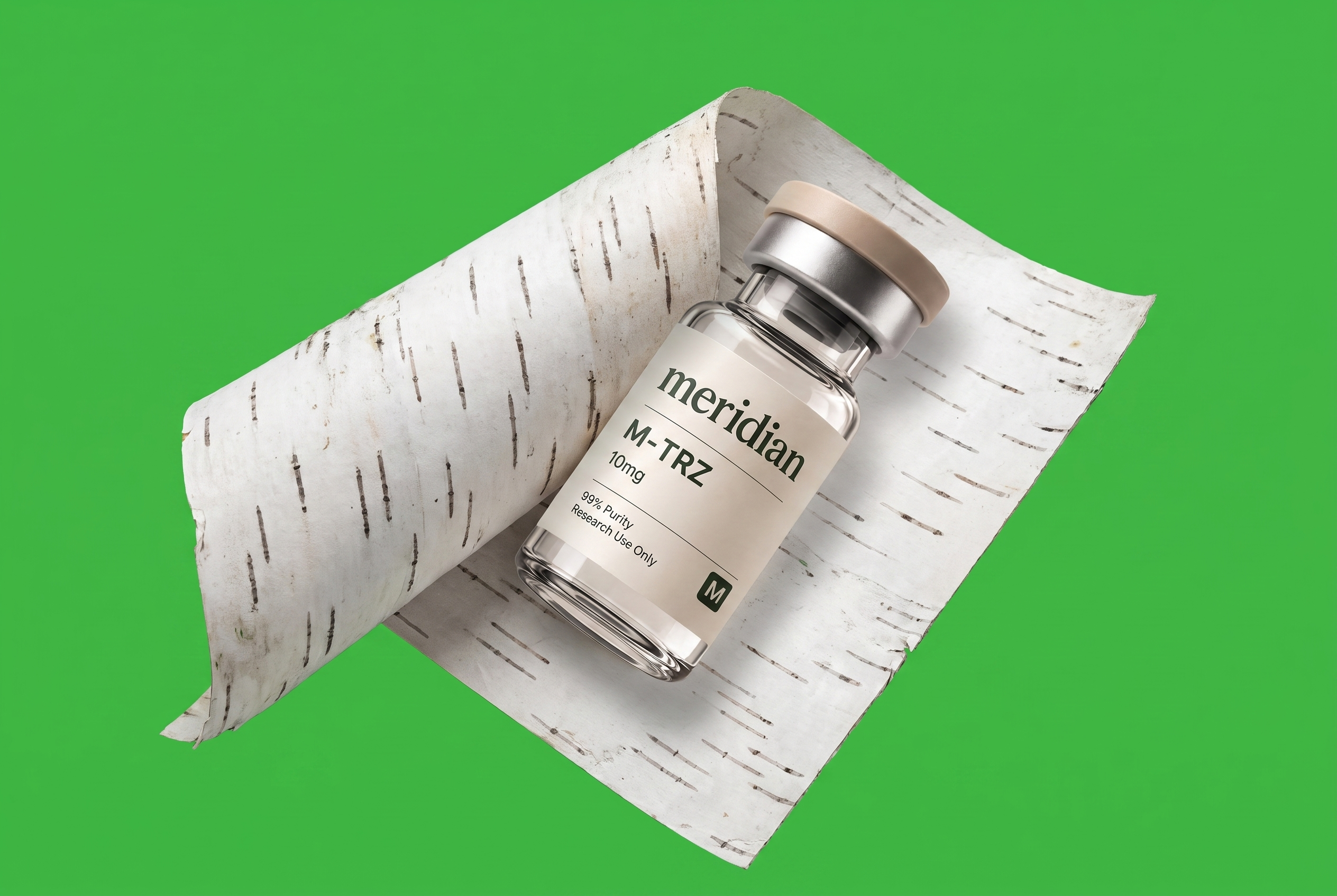 M-TRZ · BIRCH BARK
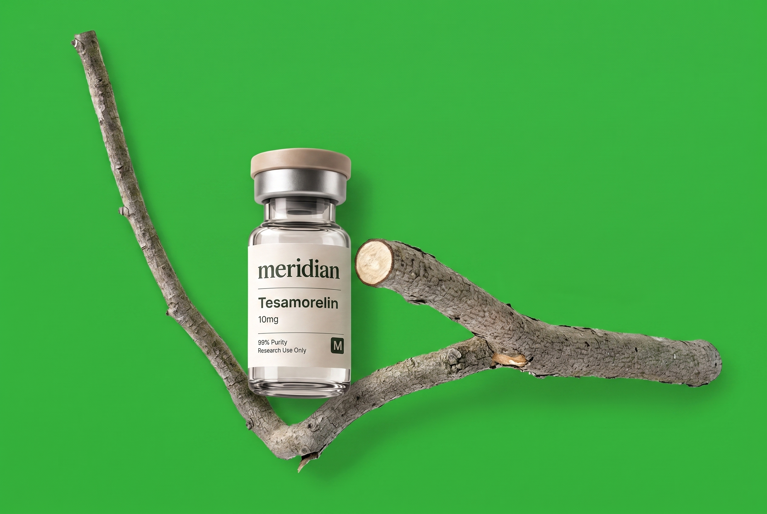 TESAMORELIN · CUT BRANCH
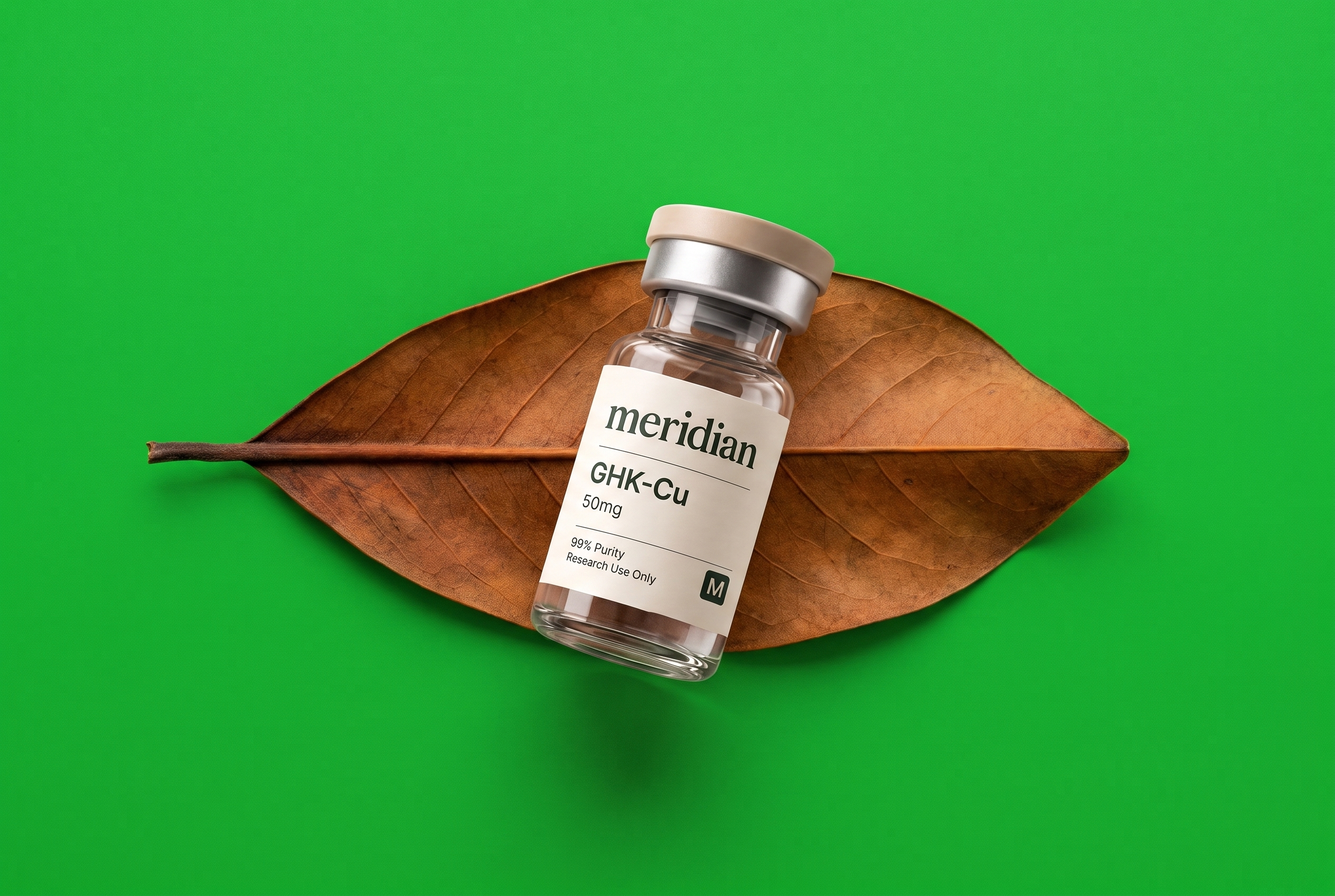 GHK-CU · MAGNOLIA LEAF
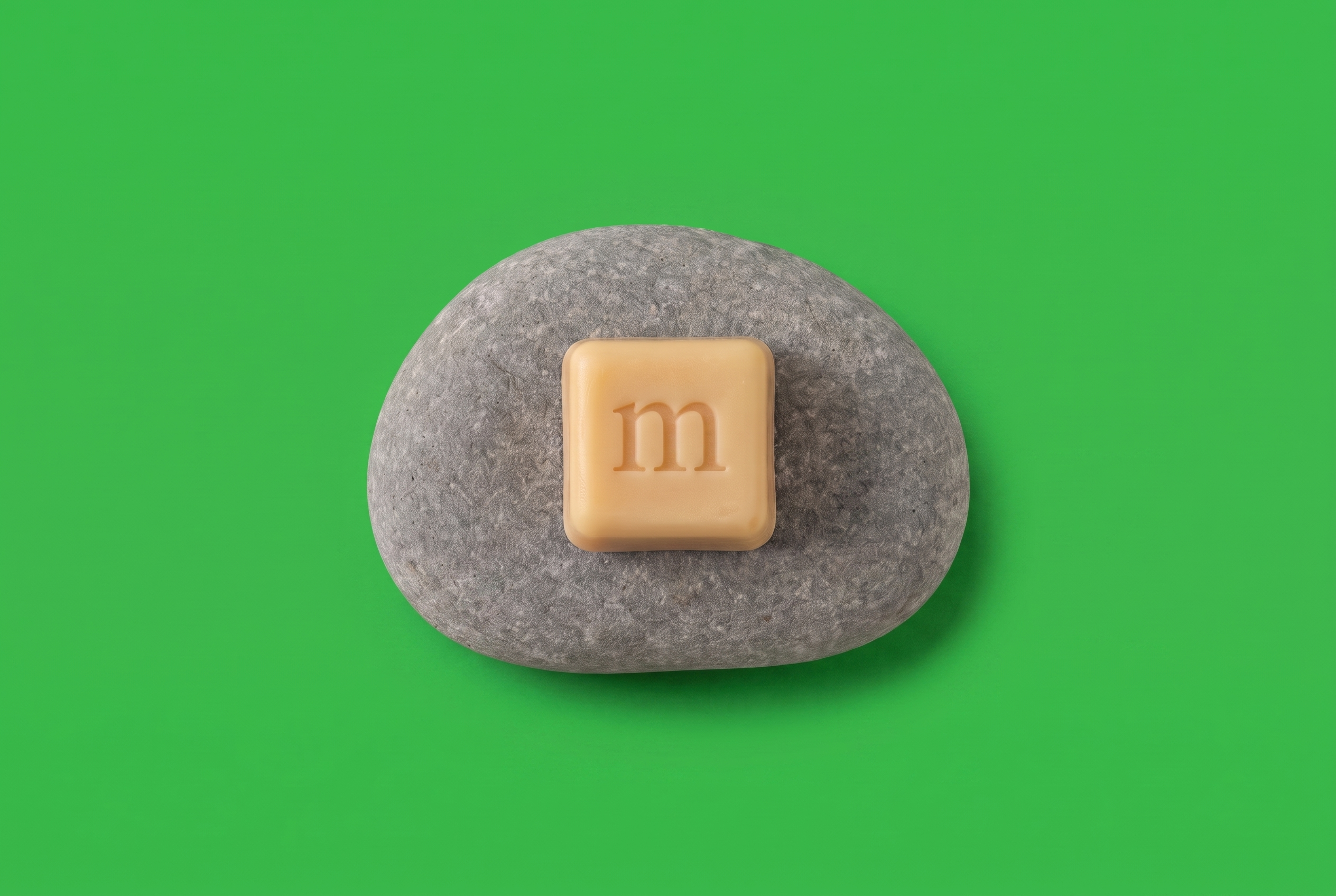 KUBIX · RIVER STONE
The same picture, as data. Every surface photograph has a twin: the frame rendered in monospace characters, signal green on vanilla, dense where the image is dark, empty where it is light. It is generated from the photograph, never drawn.
Where it shows. On hover, the surface gives way to the hood for as long as the cursor stays. On scroll it runs under the hero. Inside the pack it is printed on the inner face of the box. In the app it is the loading state and the lab-results view.
Where it never shows. On the product, on the label, as a background for the wordmark, or as decoration on its own. It only ever appears as the underside of a real photograph.
$ hood --src hero-moss.png --cols 170 --ink 44B24B
HERO · UNDER THE HOOD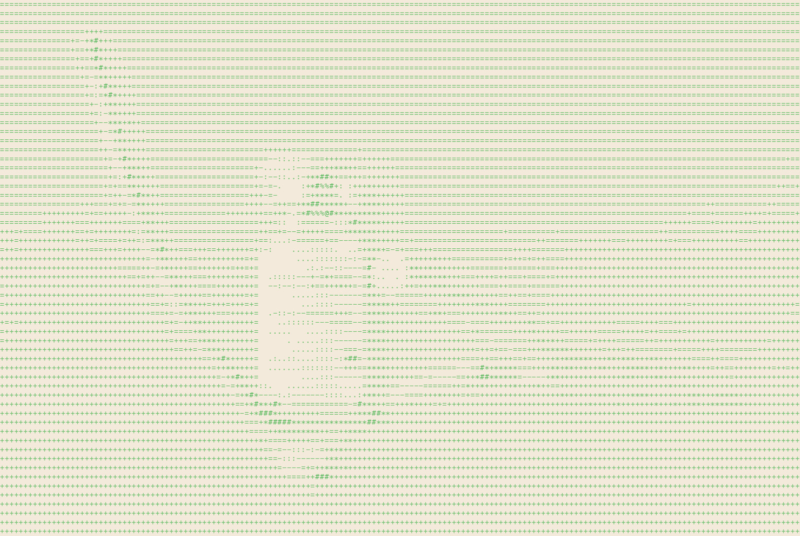 ECOPHILIA PAGE · UNDER THE HOOD
Not final. This is the system it will follow. Two formats. The vial: clear glass, a vanilla cap over a silver band, a white paper label. The cube: a warm vanilla chewable with the m pressed into its face, no print on it at all.
The label. Everything in forest green on warm paper. The wordmark first, then a hairline rule. The product name in bold sans — M-3 RT — with the dose beneath it, then a second rule, then 99% Purity and Research Use Only at the foot, and the M badge bottom right. No colour beyond the green, no pattern — the hood is printed inside the box, not on the label.
The cap is the one place colour lives on the pack, and it is vanilla on every product. Offerings are told apart by the name, not by a colour code.
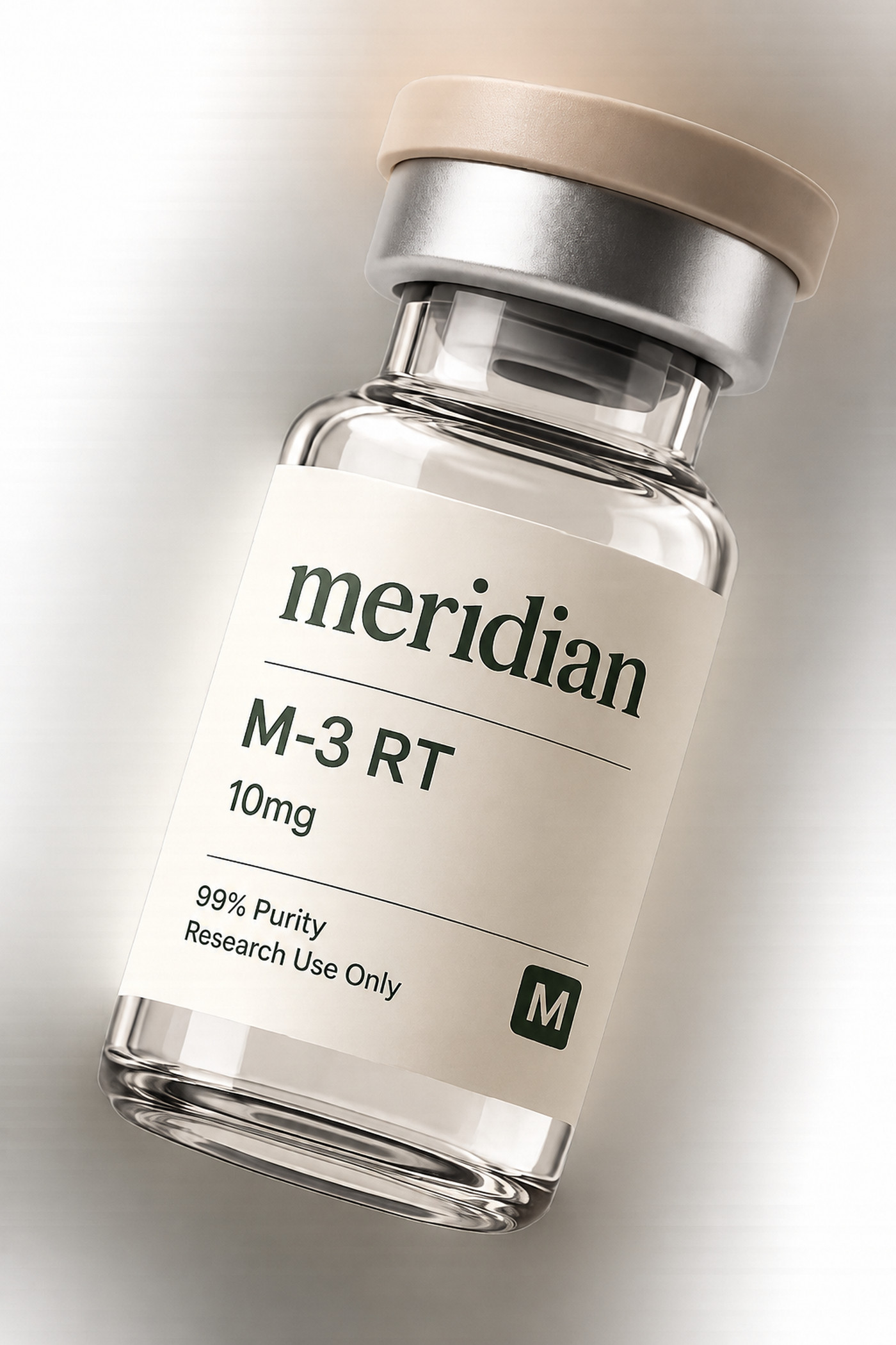 THE VIAL · M-3 RT · LABEL ANATOMY
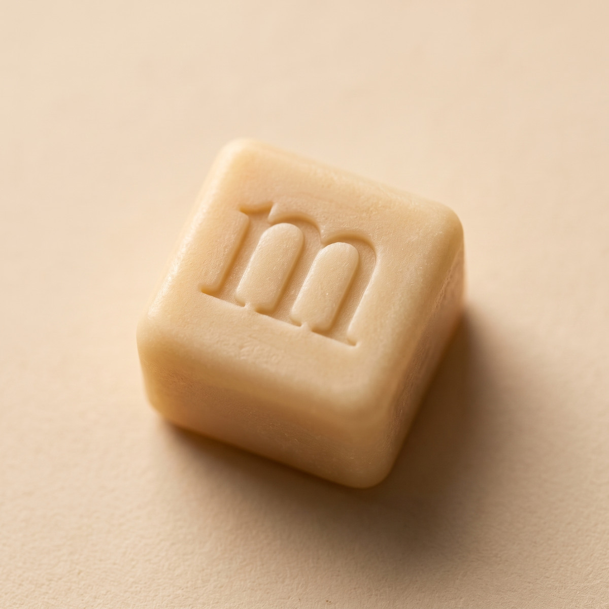 THE CUBE · KUBIX
Everything on these pages, at full size. Click a row to download.
Photography and the Ecophilia pages are rendered from the reference vial, so the label is always the real label. Under-the-hood layers are generated from their photographs.
v0.1 · the first pass · 4 sep 2026
Second. Cut from Instrument Serif; the SVG takes currentColor. The renders are the pressed versions.
 DOWNLOAD
 DOWNLOAD
 DOWNLOAD
 DOWNLOAD
 DOWNLOAD
 DOWNLOAD